The food menu becomes one of the important elements in the success of a restaurant, as well as the satisfaction and ease of customers in choosing the menu that they want to order. Because of this, there are many restaurants uses professional services to make their menu. However, you can try it by yourself if you know important thing in choosing Background for food menu Jakarta.
COLORS

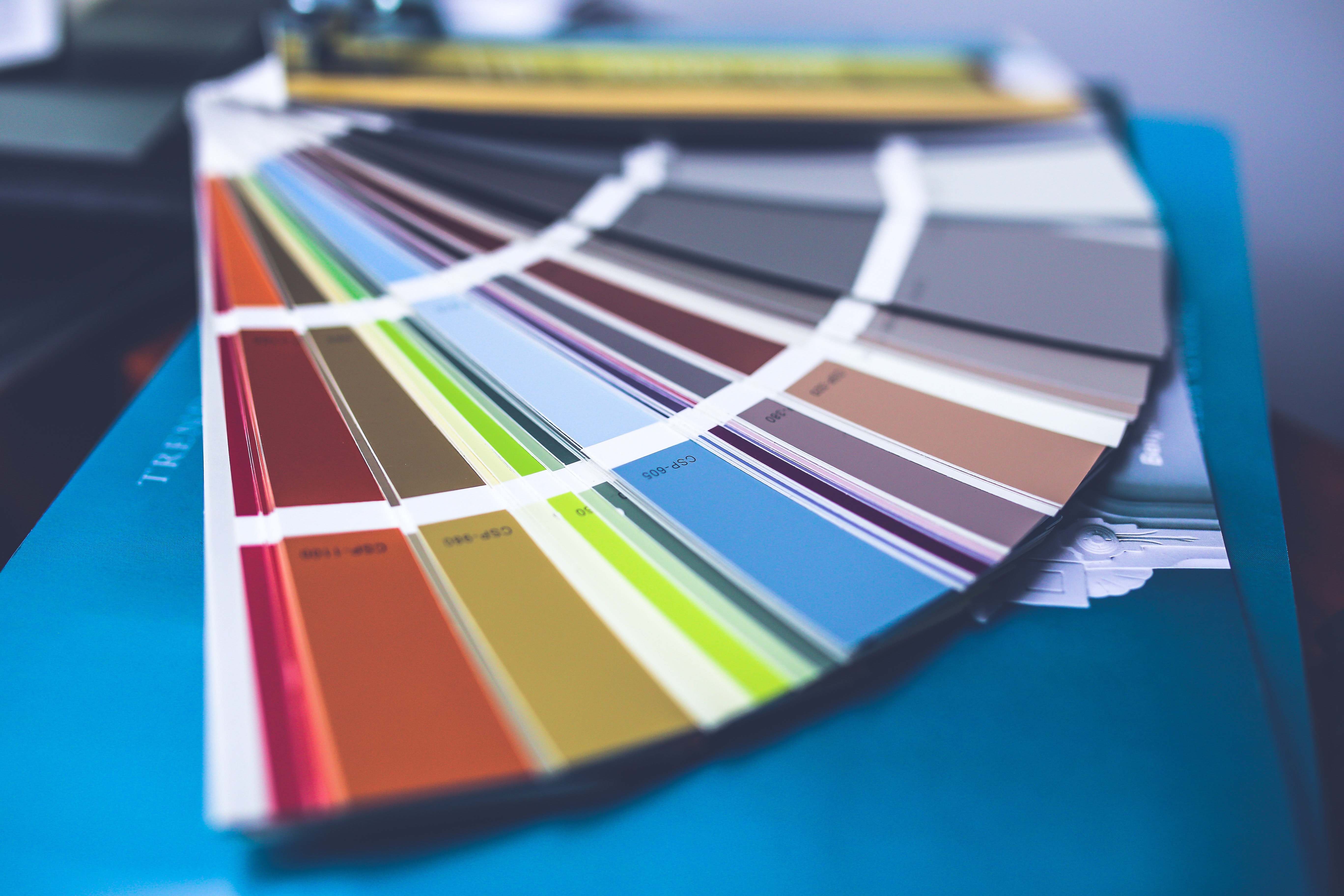
selection can be done by considering the theme of the served food. For example, for a seafood restaurant, choosing a color theme similar to sea and beach colors is highly recommended. Other than the type of food served, the restaurant nuances also need to be considered, when you choose the type of color. For example, for casual, casual and open-space restaurants, you can use pastel colors, and even bright neon colors. As for the classic and luxurious restaurants, do not use too many colors. One soft color tone is enough. And to match your food menu with that color, you can also add accents and decorations for the food menu background.
MEDIA

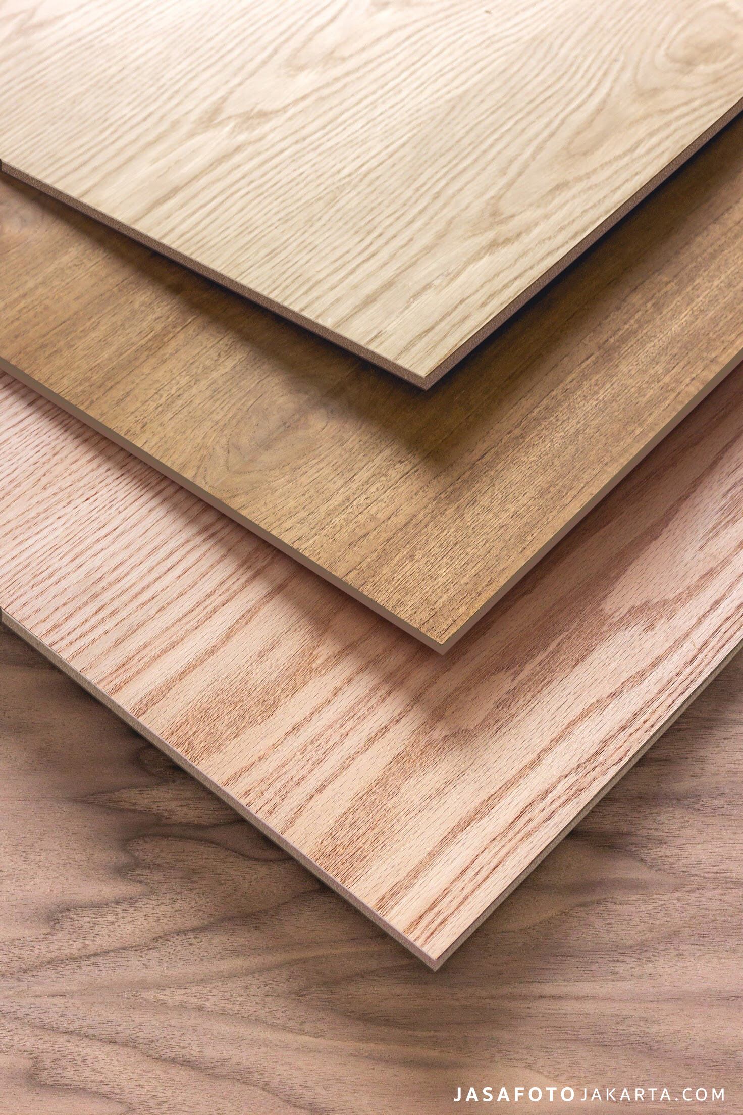
The media used for the food menu also affects the type of background that can be used. The type of paper even the type of material can add aesthetic value to that menu. What you need here is creativity. You can even use unusual material for your diet, to create a unique background, for example by using fabric or wood and directly writing down the menu served on that media. This can become the attractive point of that restaurant.
FOOD PHOTOS

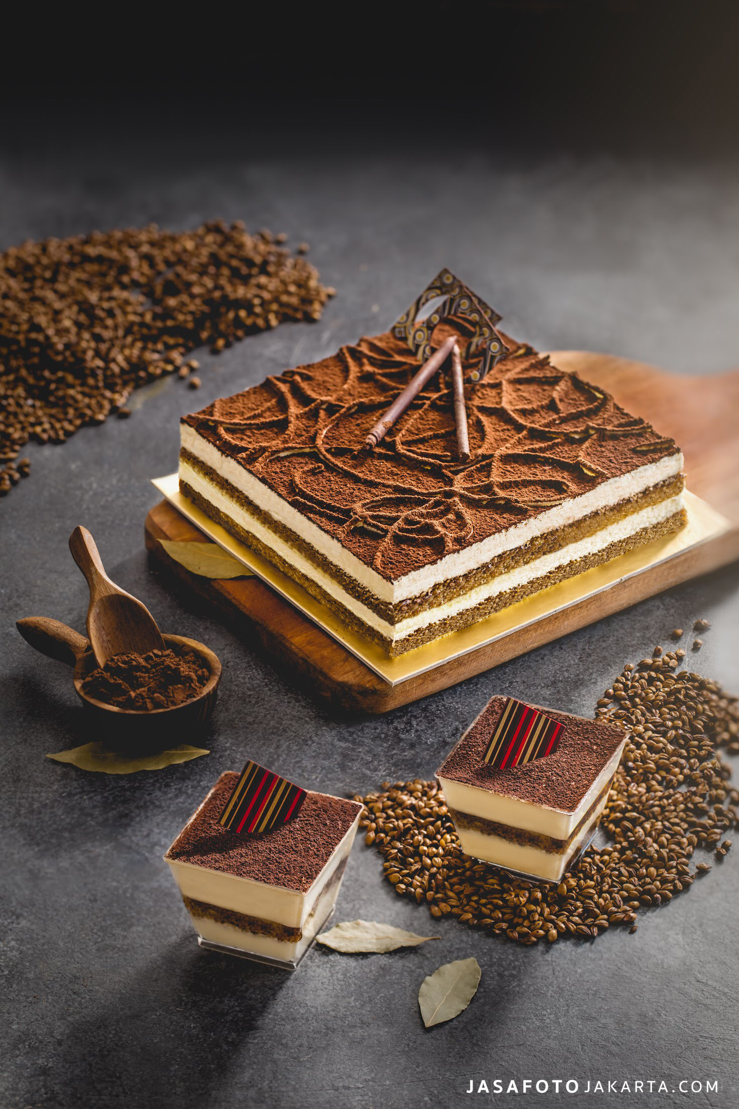
Actually, the use of food photos is not an obligation. Food photo is indeed, will make it easier for customers to see how their food looks like. Plus, food photos will increase customer interest to the menu. However, there are several restaurants that aren’t using photo on their menu. They use icons to replace food photos. This way in addition to saving costs, also makes it easier to set the layout of the list of foods in the menu. In addition, icons can also be used for foods that are well known to people. For example, for a roasted chicken dish, you can use the chicken meat icon. This already help customers understand what foods are in the menu.
Other than food photos, pay more attention to the usage of eating utensils in the photo. Make sure to use plates, bowls and other utensil that has contrast color, which can highlight food color in the photo. For drinks, you should use a transparent glass, so customer can see the contents of the drink.
Food and beverages photo can also be used as main background. For example, you create a food menu that is divided into two parts, the right part for food and the left part for a drink. You can take photos of all the food on the menu and put it into the background of the food section, and do it the same on the drinks section.
BACKGROUND COMPOSITION

After deciding which colors and photos or icons you use, the next thing to consider is the background composition. Decide which section you will use the color or photo that you choose. If there is free space, make sure you fill it out, for example by adding food photos, restaurant logos or using accent or decoration with contrast color from the main background. It won’t only make it beautiful, but also this can make the menu isn’t boring.
I am text block. Click edit button to change this text. Lorem ipsum dolor sit amet, consectetur adipiscing elit. Ut elit tellus, luctus nec ullamcorper mattis, pulvinar dapibus leo.


